:no_upscale())
Schweden startet Prüfungen zur Barrierefreiheit von Online-Shops
Geschichte lesen
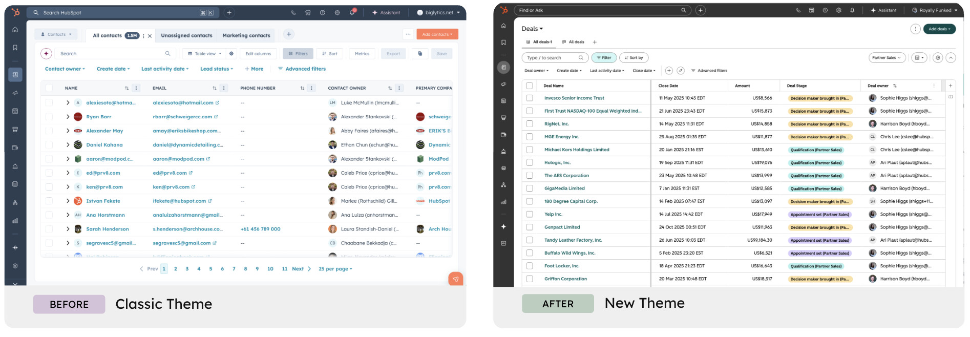
The new HubSpot theme isn't just a restyling. Behind it sits a rebuilt design system — and a decision that comes down to WCAG.
As of 31 August 2026, HubSpot has a new interface. And the orange buttons are gone. For many users that was the hardest part to accept: orange was HubSpot. The reason behind the decision, though, is more interesting than the decision itself — that colour didn't meet WCAG contrast requirements. It's a sign of something deeper. HubSpot is changing how people interact with the product, and to do that it had to rebuild the platform's visual foundations. Accessibility is one of the reasons, stated openly by the company.
 Where the change comes from
The starting point is an observation HubSpot makes about itself: for years, software demanded something from users before giving anything back. You had to learn the tool, work out where to go and how to get things done. The burden of getting value out of the product sat with the person using it.
The stated goal is to reverse that relationship: a product that surfaces what matters without you having to go looking for it, with AI built into the workflow rather than bolted on as a separate feature.
The plan runs in two stages:
Stage 1 — the visual refresh, already live. A lighter feel, cleaner typography, more deliberate spacing, and lighter headers so the content itself takes centre stage.
Stage 2 — the redesign of how the product works, rolling out gradually over the next six months.
So the refresh isn't a restyling for its own sake: it's the foundation everything else will sit on. HubSpot chose to introduce it first and gradually, so that the full redesign feels familiar rather than jarring when it arrives. And this is exactly where accessibility comes in.
30 June 2026 — optional public beta
31 August 2026 — automatic rollout to all users
Changing: colours, typography, border radii, icons, spacing, elevation and motion.
Not changing: navigation, structure, workflow and reporting logic. There's nothing to relearn.
HubSpot's answer is technical before it is aesthetic.
The platform's design system hadn't been updated in almost a decade. In that time the product grew to hundreds of apps, each with slightly different components, colours and interaction patterns. It's why a dropdown in one app behaved differently from the same dropdown in another — and why dark mode never arrived.
Over the past two years the company rebuilt the entire system from the ground up, standardising filters, tables, modals and every other building block. The new theme is the visual expression of that system.
And according to HubSpot, completing this migration is the precondition for shipping three things: dark mode, an expanded set of themes, and full product accessibility.
That's the part worth pausing on. Accessibility wasn't treated as a feature to add later, but as something that required rebuilding the visual infrastructure. When you have hundreds of components each behaving in its own way, there's no realistic path to making them accessible one by one.
Here comes the most significant decision — and the one users pushed back on hardest.
Orange was HubSpot's signature colour on primary action buttons. In the new theme it's gone. The reason, as stated by the company: orange on white doesn't meet the minimum contrast required by WCAG 2.1 level AA, making it hard to read for people with visual impairments.
HubSpot tried darkening it. But to push orange dark enough to pass, the colour turns brown and loses what makes it orange in the first place. Hence the decision to remove it from primary actions, with the possibility of bringing it back through alternative themes later.
It's a decision worth looking at closely: a company with enormous brand recognition accepted giving up its signature colour on a central interface element, because it failed an accessibility requirement.
The tension between brand identity and compliance is real, and it's usually resolved the other way — keeping the colour and deferring the problem. Here it went differently.
The backend — what you see working inside the CRM — benefits from the update.
The frontend — website, landing pages, emails and forms you build with HubSpot and that reach your users — stays exactly as accessible as you've made it.
An updated theme in the CRM doesn't make a landing page compliant if it has insufficient contrast, a form without associated labels, or an image with no alt text. And those are precisely the pages that fall within the scope of the European Accessibility Act.
One thing is worth noting: across all of HubSpot's communication, accessibility never appears as a regulatory obligation. There's no mention of penalties, deadlines or requirements. It appears as part of a product decision — alongside dark mode, customisable themes and component consistency.
That's a sign of maturity. Accessibility is moving out of the compliance box and into the quality-of-experience box, where it always belonged.
And the orange case demonstrates it better than any statement of principle: insufficient contrast doesn't only penalise people with a visual impairment. It penalises anyone working in bright sunlight, anyone on a cheap monitor, anyone looking at the interface at the end of a long day. Making a button legible improves the experience for everyone, not for a minority.
When accessibility is designed in this way — as a constraint that raises overall quality, rather than a box to tick — it stops being a cost and becomes what it always was: good design.
Check your website's accessibility for free with Eye-Able®!
Schweden startet Prüfungen zur Barrierefreiheit von Online-Shops
Geschichte lesen:no_upscale():format(png))
Gilt das BFSG auch für den B2B-Bereich?
Geschichte lesen:no_upscale():format(png))
Eye-Able als Alternative: Warum einzelne Tests nicht genug sind
Geschichte lesen:no_upscale():format(png))
Wie erkennt man eine wirklich barrierefreie Website?
Geschichte lesen:no_upscale())
Zeigt euer Engagement mit dem Eye-Able Siegel für digitale Barrierefreiheit
Geschichte lesen:no_upscale():format(png))
BFSG & EAA: Was Schweizer Unternehmen für den EU-Markt beachten müssen
Geschichte lesen:no_upscale())
Warum 4 Supermarkt-Riesen jetzt vor Gericht stehen
Geschichte lesen:no_upscale())
BFSG-Dokumentationspflicht: Ab 2026 wird geprüft
Geschichte lesen:no_upscale():format(png))
Von der Einzellösung zur Plattform: Die Evolution der digitalen Barrierefreiheit
Geschichte lesen:no_upscale())
Manuelle Barrierefreiheits-Tests: Warum automatisierte Tests nicht genug sind
Geschichte lesen:no_upscale():format(png))
Das Fashion Nova-Urteil: 5,15 Millionen USD als Folge fehlender Barrierefreiheit
Geschichte lesen:no_upscale():format(png))
5 Jahre Eye-Able: Gemeinsam für digitale Barrierefreiheit
Geschichte lesenContact us and we will be happy to help you.
Kontaktiere uns und wir freuen uns Dir zu helfen.
:no_upscale():format(png))
:no_upscale():format(png))