:no_upscale())
Pourquoi 4 géants de la grande distribution sont poursuivis en justice
Lire l'histoire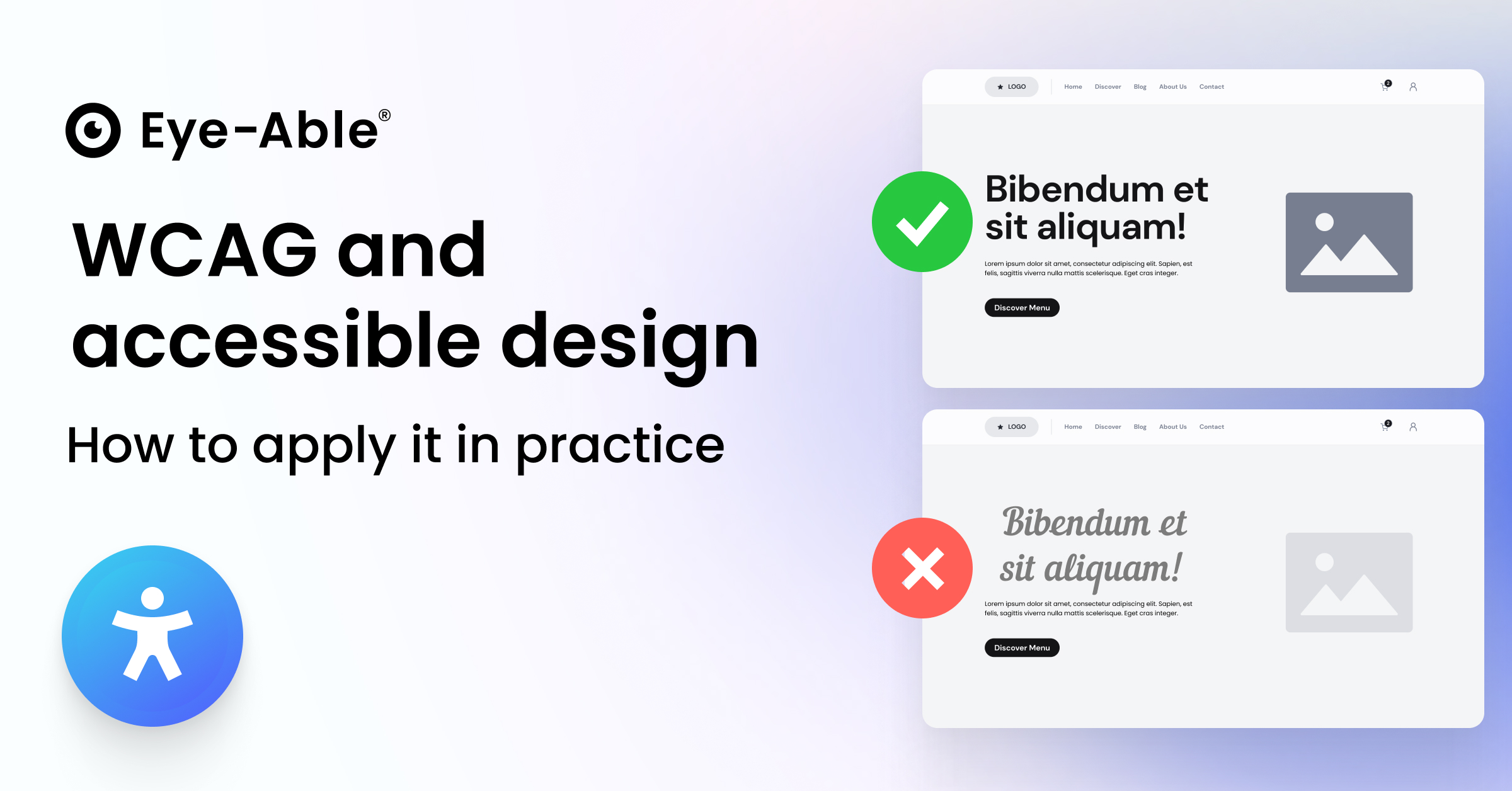
Imagine you want to buy a train ticket online. But the text is so small it’s barely legible, the buttons have poor contrast, and important information is conveyed by colour alone. For many people with visual impairments or cognitive limitations, that’s a real barrier.
This is exactly where accessible design comes in: designing content so that it can be understood and used by everyone.
The Web Content Accessibility Guidelines (WCAG) provide the international standard for doing just that. They show how colour, typography, layout and interaction can be designed inclusively.
Companies that apply these principles not only create a better user experience, but also reach new audiences and expand their digital visibility.
Accessible design covers all design aspects that ensure digital and physical content can be used by people with different abilities and limitations.
A legible typeface and sufficient contrast, for example, benefit not only people with visual impairments but also older users or those in bright environments.
It’s based on the four core WCAG principles:
Perceivable, Operable, Understandable and Robust.
The advantages go far beyond people with disabilities. Accessible design improves usability for everyone, increases the reach of your content and can even have a positive impact on search engine optimisation.
The Barrierefreiheitsstärkungsgesetz (BFSG) translates the European Accessibility Act (EAA) into German law. It obliges companies to design their digital products and services to be accessible.
The regulation particularly affects online shops, banking websites, travel portals and digital health services.
The EN 301 549 standard serves as the technical framework, referring to the WCAG 2.1 as the minimum standard for digital accessibility.
The Web Content Accessibility Guidelines (WCAG) 2.2, published in December 2024, expand the previous version by nine new success criteria.
They define three levels of compliance:
Level A: Basic requirements
Level AA: Recommended standard for most digital products
Level AAA: The highest level of accessibility
For compliance with the BFSG, Level AA is generally sufficient and practical to implement.
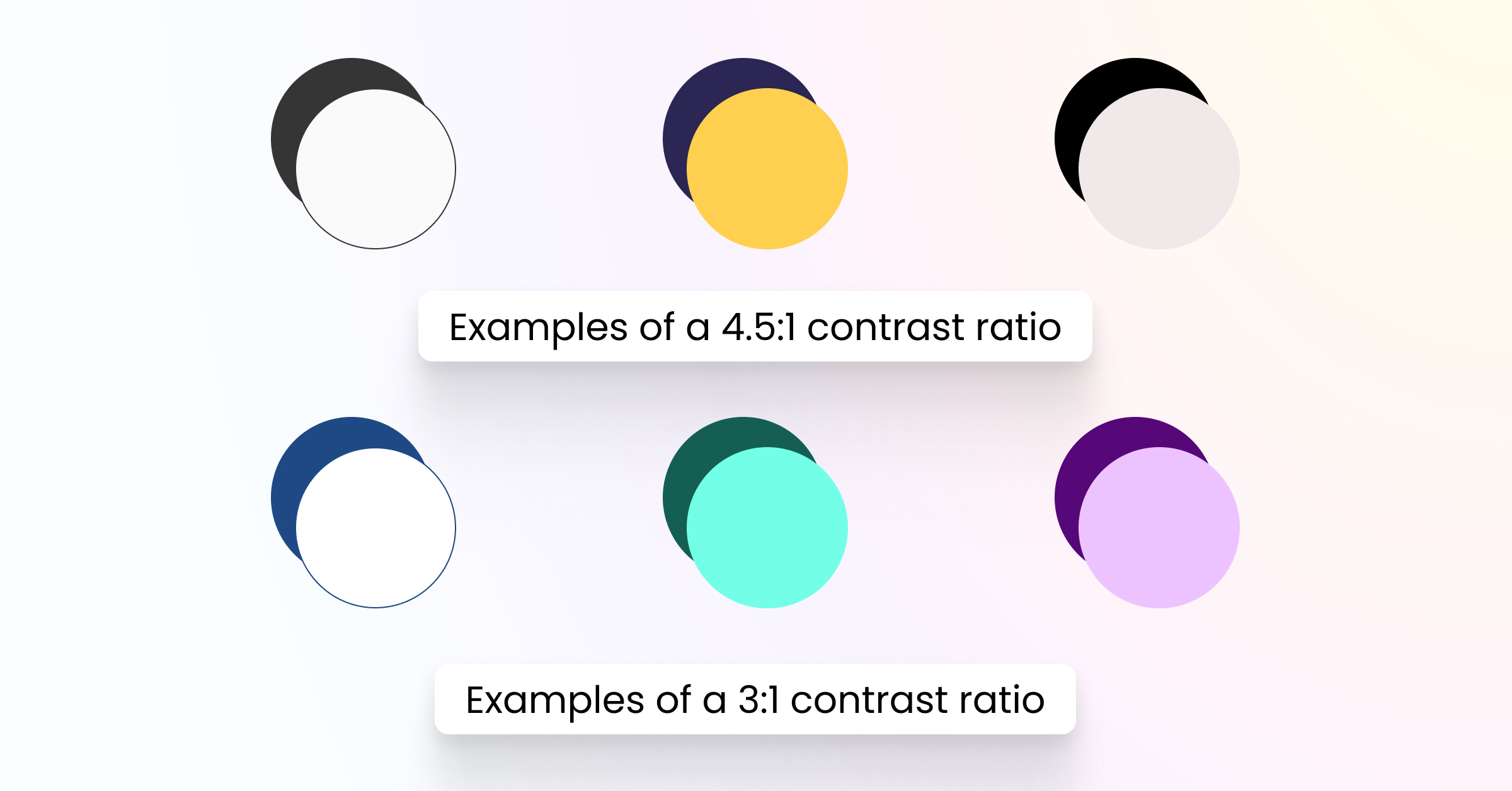
Key contrast requirements under WCAG 2.2
For normal text, the minimum contrast ratio required is 4.5:1 for Level AA compliance, and it increases to 7:1 for the stricter Level AAA compliance.
For large text, defined as text that is 24 pixels or larger, or 19 pixels and bold, the requirements are slightly lower. The minimum contrast ratio is 3:1 for Level AA and 4.5:1 for Level AAA.
Finally, for graphical user interface (GUI) elements, there is no specific minimum ratio required for Level AA (indicated by the dash). However, Level AAA requires a minimum contrast ratio of 3:1.
The DIN 1450 standard defines the criteria for font legibility, taking into account demographic change and the needs of people with visual impairments.
For accessible PDFs, structural tags, a logical reading order and alternative text descriptions are essential.
In print design, DIN 1450 recommends humanist serif typefaces such as Garamond or Sabon Next, which are particularly easy to read for longer texts.
Do:
Use clear, simple language and avoid long, complex sentences
Structure your text logically with meaningful headings
Choose inclusive, gender-sensitive wording
Keep paragraphs short and sentences concise
Don’t:
Use complicated jargon without explanation
Use gender-exclusive language
Write overly complex or nested sentencesTypografie & Lesbarkeit
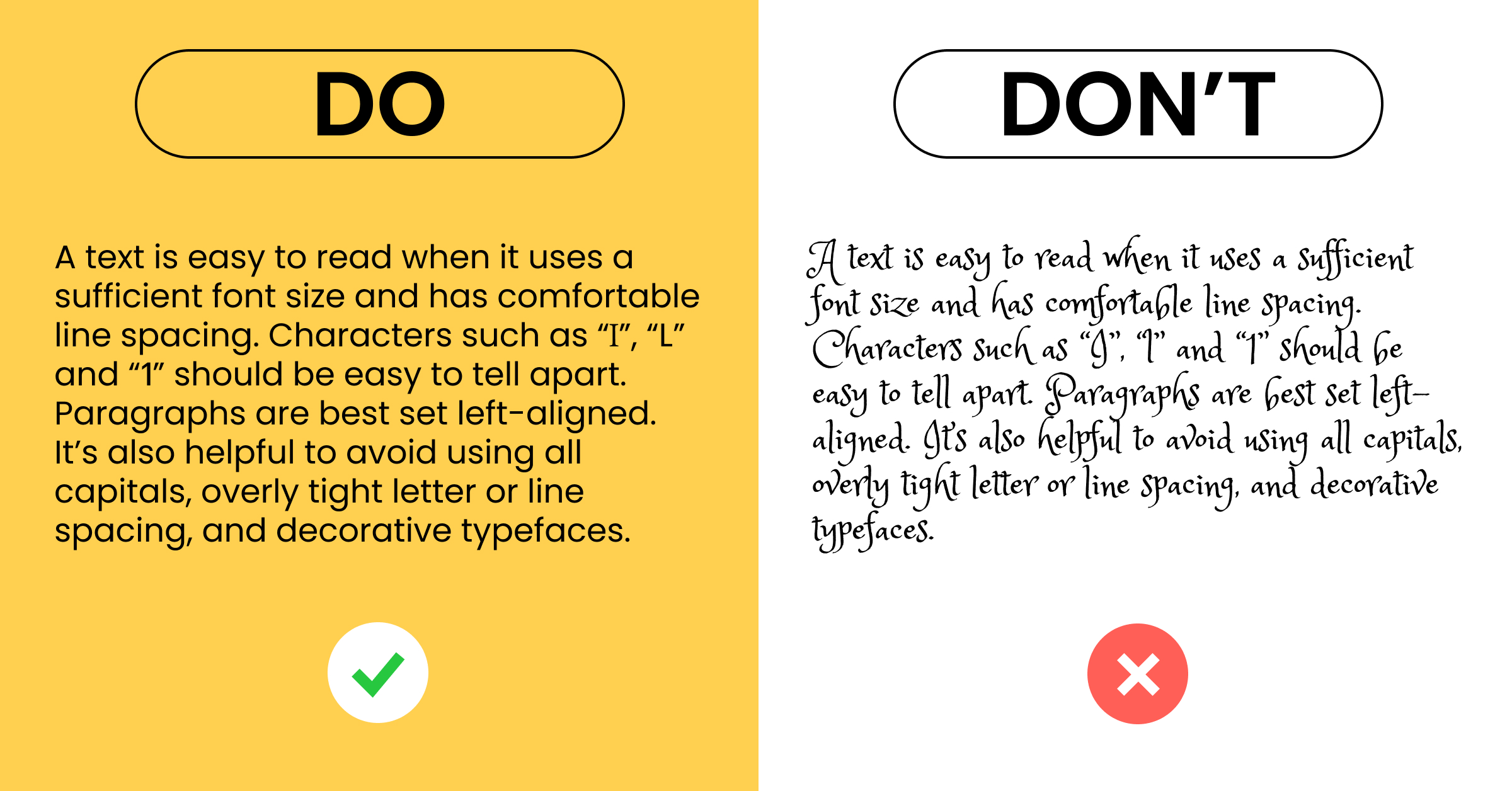
There is no single “accessible font” — accessibility depends on various factors such as x-height, character distinction, font size and spacing.
Proven, easy-to-read typefaces include Inter, Roboto, Open Sans, Verdana and Arial.
For special requirements, Neue Frutiger 1450 is recommended by DIN 1450.
Do:
Use a minimum font size of 14–16 px for body text
Set the line spacing to at least 1.5 times the font size
Use left-aligned, ragged-right text for better readability
Don’t:
Write long passages in all caps
Use centred alignment for long text blocks
Choose small font sizes or fonts with low legibility
Use serif typefaces on screens (except in specific contexts)
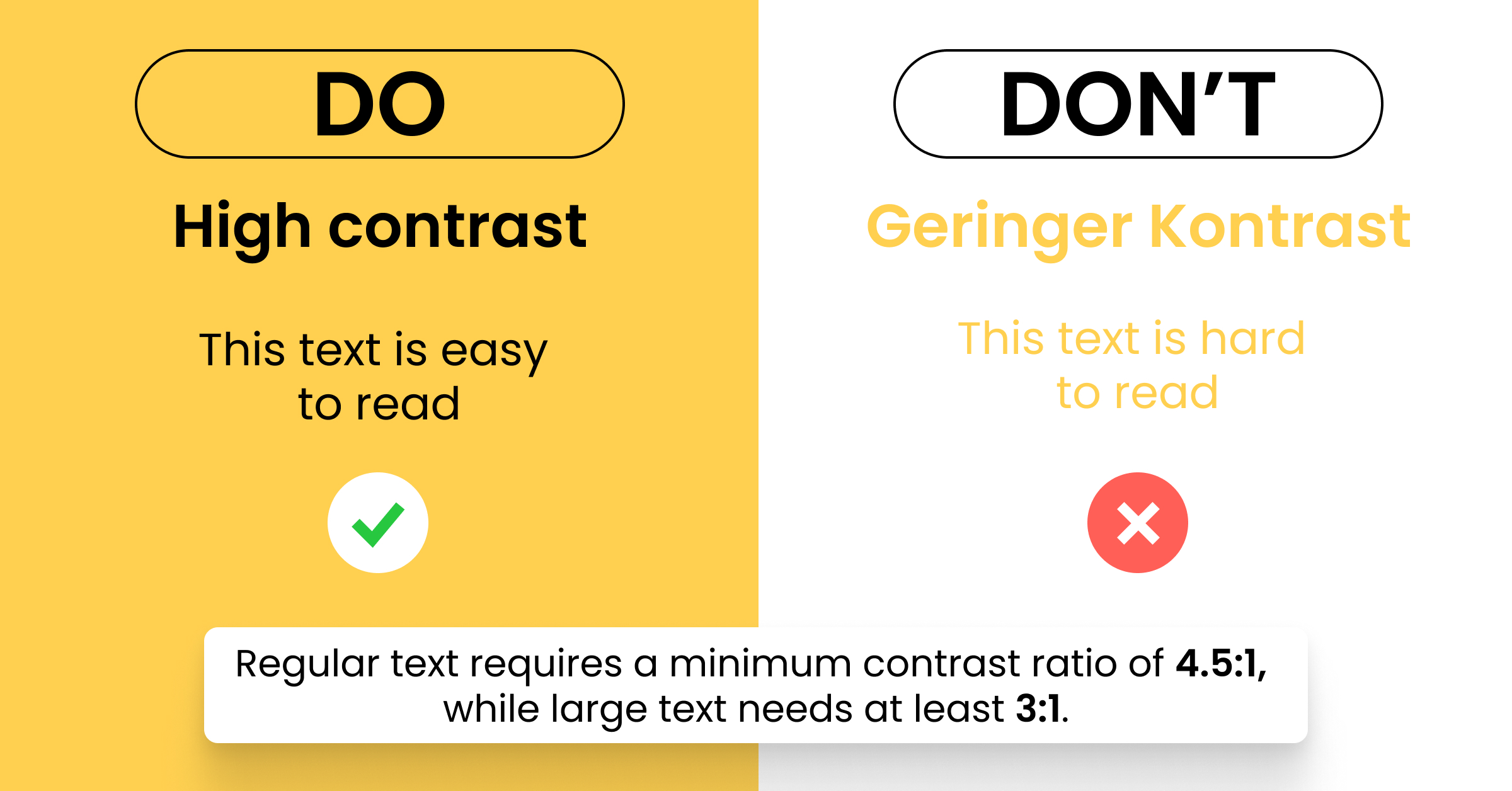
Colour contrast plays a crucial role in readability.
The WCAG 2.2 defines clear minimum requirements, which can easily be checked using tools such as the WebAIM Contrast Checker or Colour Contrast Analyser.
Do:
Ensure a contrast ratio of at least 4.5 : 1 for normal text
Use strong contrasts between text and background
Provide additional visual cues (such as icons or patterns) instead of relying on colour alone
Don’t:
Use red–green combinations for important information
Communicate information through colour alone
Choose weak contrasts such as light grey on white
A clear, well-structured layout is key to accessibility. Visual order helps users process information more easily and navigate intuitively.
Do:
Use consistent grid structures to guide the eye
Provide generous white space to avoid clutter
Reduce cognitive load through clear visual hierarchies
Keep navigation and interactive elements consistent across all pages
Don’t:
Create overloaded layouts with too many visual elements
Ignore visual hierarchy in headings and spacing
Place navigation elements inconsistently on different pages
Alternative text (alt text) is essential for people with visual impairments.
It should describe the content and function of an image precisely and meaningfully.
The rule of thumb: “As short as possible, as long as necessary.”
Do:
Provide descriptive alt text for all images
Use inclusive and diverse imagery
Add captions and transcripts for videos
Offer descriptions for complex graphics or infographics
Don’t:
Leave alt text empty or use meaningless labels such as “image1.jpg”
Place text on busy or patterned backgrounds
Publish videos without subtitles or audio descriptions
Tables and infographics must be structured clearly so that assistive technologies, such as screen readers, can interpret them correctly. This ensures that complex information remains accessible to everyone.
Do:
Use a clear table structure with defined header rows and columns
Add labels that can be recognised by screen readers
Maintain a logical reading order
Provide text descriptions for complex data visualisations
Don’t:
Use nested tables without a clear structure
Omit column or row headings
Use layout tables purely for visual design purposes
Accessible design should always be considered across all media.
Digital content needs to be responsive and optimised for various devices and screen sizes.
For PDF documents, structural tags and a logical reading order are indispensable. These elements allow assistive technologies to interpret the content correctly and provide a smooth reading experience for all users.
Putting accessible design into practice requires both technical know-how and an understanding of users’ needs.
Interactive elements such as navigation menus, forms and buttons must be fully operable via keyboard. The Tab key should allow users to move through the page in a logical, predictable order.
When it comes to forms, clear labels, understandable error messages and easy correction options are essential.
Buttons should have meaningful labels and adequate touch targets (at least 44 × 44 pixels).
Automated testing with tools such as axe DevTools or WAVE
Manual testing using screen readers and keyboard navigation
User testing involving people who rely on assistive technologies
Regular audits with accessibility platforms such as Eye-Able
A frequent mistake is focusing solely on visual design without considering usability for all users.
Many designers only think about accessibility after a project is completed, rather than integrating it from the start.
One-off adjustments without continuous monitoring
Lack of involvement of people with disabilities in the design process
Insufficient training for design and development teams
Neglecting accessibility in agile workflows and sprints
Accessible design is not a one-off project, but a continuous process that must be considered in every stage of design and development.
Investing in accessibility not only ensures legal compliance, but also creates better user experiences for everyone and opens the door to new audiences.
With the introduction of the BFSG, accessible design has become a legal requirement – but it should also be seen as an opportunity to make digital products usable and enjoyable for all people.
Eye-Able offers a comprehensive platform for analysing, implementing and continuously monitoring digital accessibility, helping organisations stay compliant and inclusive in the long term.
What is the difference between accessible design and accessible web design?
Accessible design is a broader concept that includes all design aspects — both digital and physical.
Accessible web design, on the other hand, focuses specifically on websites and web applications.
What is an accessible format?
An accessible format allows people with different abilities to perceive and understand content without barriers.
Examples include:
Structured PDFs with proper tagging
HTML with semantic markup and ARIA attributes
Videos with subtitles or transcripts
What is meant by universal design?
Universal design is a concept in which products and environments are created so that they can be used by as many people as possible, without the need for further adaptation.
It goes beyond accessibility, taking the diversity of human abilities into account from the very beginning.
See how accessible your website design is – simply use the free Eye-Able Accessibility Check.
Pourquoi 4 géants de la grande distribution sont poursuivis en justice
Lire l'histoire:no_upscale():format(png))
:no_upscale():format(png))